PRIO
Transição Energetica Website.
Exploring Innovative Solutions for Energy Transition with Agility and Visual Impact
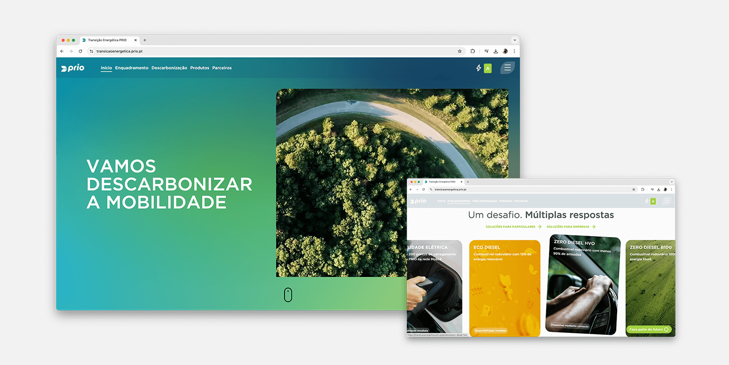
At PRIO's request, we developed a website that complements their main platform, aggregating all energy transition solutions offered by the company. The goal was to create a modern, fluid, and responsive design with a strong visual impact, offering agile and intuitive navigation. In addition to showcasing solutions, the website also encourages carbon change for both businesses and individuals.
The new website delivers a powerful visual impact, centered around a storytelling approach that effectively conveys PRIO’s core message and energy transition solutions. The design was crafted to create an immersive experience, guiding users through the company’s initiatives with a narrative that engages and educates. This focus on storytelling is the website’s primary objective, enhancing how PRIO communicates its vision to users.
In addition to the strong visual impact, the website features a modern, responsive design that adapts seamlessly to any device. The carbon impact calculator was integrated interactively, allowing visitors to easily assess the environmental impact of their travel. Sections for business partners and articles were organized to ensure easy access to relevant content. The overall user experience was enriched with smooth, interactive animations that make navigation dynamic and enjoyable, while also ensuring a cohesive and intuitive interface across all platforms.
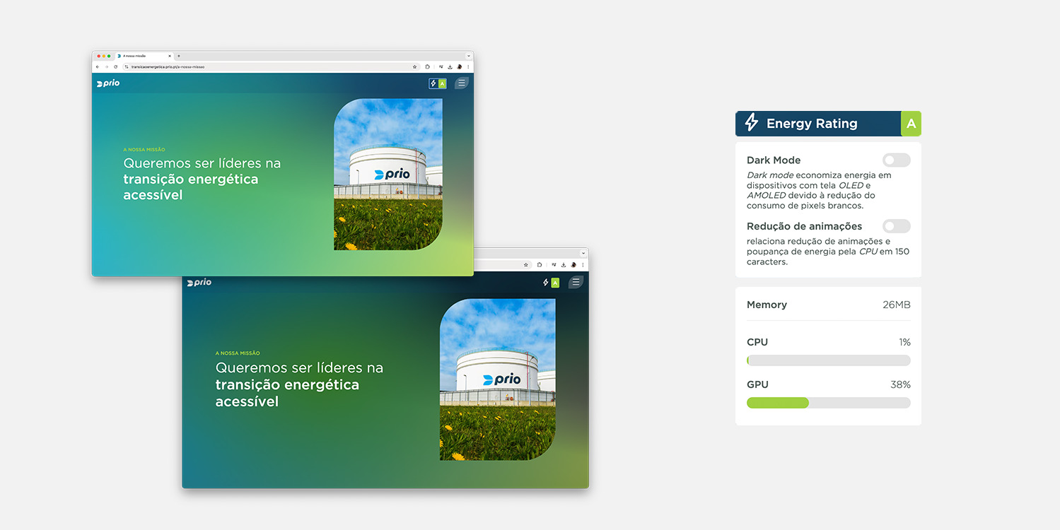
A part of that, the website incorporates features that promote sustainable viewing by reducing energy consumption. Options like dark mode and an animation-free version are available on every page, ensuring accessibility to information without compromising content readability.


The website was developed using React and Next.js, ensuring fast, dynamic navigation. Tailwind CSS was used to create a flexible, responsive design, while GSAP was integrated to add smooth, interactive animations, including scroll effects. The content management system was built with Sanity, a robust platform that facilitates easy updates and site maintenance. The platform also integrates Google Analytics for real-time data monitoring and continuous optimization of the user experience.